Delicious! 9 Popular Kitchen Colors to Paint Your Walls
How do you find a paint color that fits best with your kitchen? Start with some inspiration from these popular kitchen colors and find a fit for your style.
The holiday season is around the corner. And that means you and all of your loved ones are spending more time in the kitchen.
But is your kitchen painted the right color to serve as your holiday backdrop? Choosing the right paint color for any room in your home can be an intimidating endeavor. With so many popular kitchen colors to pick from, how can you ever make a decision?
The meaning of and feelings evoked by different colors can help. And that’s why we’re guiding you through the best colors for your kitchen this holiday.
Ready to discover the perfect new paint color for your kitchen space? Then keep reading for our guide to the top 9 kitchen hues this season.
1. Go Bold Red
Of all the colors you can paint your kitchen, red might be a bold choice but it’s also a great one. Red is associated with energy, strength, and love. It also has been shown to increase human metabolism, which may stimulate your appetite.
If red is too loud for your quaint little kitchen, you could choose a related color. Burgundy is an excellent choice for any red wine enthusiasts out there. And even magenta can brighten up your space if you’re feeling daring.
2. Choose a Peaceful Blue
Unique and authentic, blue is becoming more and more popular with homeowners. Blue stands for peace, flexibility, and imagination, which is perfect for a relaxing kitchen. This color also offers an exciting range of shades like:
- Teal
- Turquoise
- Aquamarine
Don’t just limit blue to the walls, though. Cabinets and even the ceiling also look great with a nice fresh coat of blue paint.
3. Keep it Neutral with Brown
In direct contrast to red, brown is a nice safe choice that will blend nicely with the rest of your home. Brown is thought of as a dependable color as well as bringing up words like resilience and reliability.
The best part is you won’t have to worry about whether those new kitchen decorations will match your space. And you have so many different shades to choose from. Go for a lighter brown to open up your space or choose a deeper brown for a more mature vibe.
4. Don’t Worry, Be Yellow
Yellow is one of the most popular colors not just in the kitchen, but the entire house. And since this bright hue represents happiness, joy, and energy, it’s no wonder. If you want your kitchen to feel like a breath of fresh air, this is the color choice to inspire you.
However, keep in mind that there is such a thing as too much yellow. Yellow in every room can be extremely overwhelming and has been known to make babies cry. If you just can’t get enough yellow, choose a darker shade of amber or a lighter beige.
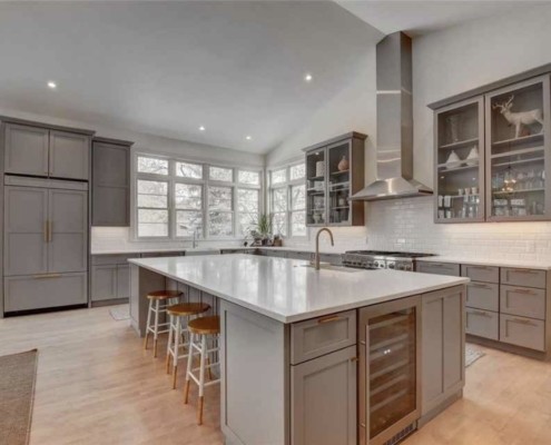
5. It’s a Grey Area
Grey may seem like an untraditional choice for kitchen color. But professional painters report that this hue is becoming trendy with younger homeowners. That’s because it’s a neutral that blends in perfectly with the typical kitchen colors and matches smartly with your stainless steel appliances.
6. Grow with Green
The color of nature, green is the perfect color for a kitchen-owner who wants to bring the outdoors in. Green harkens to thoughts of growth and freshness, perfect for the heart of the home. Choose from a variety of beautiful shades, including:
- Emerald green
- Mint
- Apple green
This color is also considered beneficial for both the brain and the body, offering a calming effect like the color blue. But keep in mind that green slows down the metabolism, which means a green kitchen may not inspire a hearty appetite.
7. Go for a Traditional Whitewash
White was once a staple color for the home and kitchen but it’s fallen out of fashion today. We think that’s a shame, though, considering that white walls will go with absolutely any of these other popular kitchen colors.
The color white is most obviously associated with purity, light, and goodness. But it also represents a new beginning and cleanliness. And who doesn’t want a kitchen that screams fresh and clean?
8. Orange You Glad
A double whammy, orange combines the joy of yellow with the energy of red. An orange kitchen will make you feel enthusiastic and determined– even during a full day of holiday feast preparations.
Orange is also associated with the tropics. If you’re prone to the winter blues, a tropical-inspired kitchen may be just the boost you need. Just pull up a chair in your freshly-painted kitchen and pour up a pina colada to feel like you’re sailing away on an ocean vacation.
9. The Little Black Kitchen
Black has long been a taboo color in stylish homes, but this is changing. In a spacious kitchen with lots of natural light, black can really shine. That’s because, in addition to its more negative connotations, black also stands for elegance and formality.
Is your family more interested in sipping wine over great conversations than roasting marshmallows over the fire? Then a black kitchen may just be the perfect dash of style and luxury you’ve been looking for.
Get One of These Popular Kitchen Colors on Your Walls!
Want to spruce up your space with one of these popular kitchen colors? Don’t waste time this holiday doing it yourself. Get in touch with Calgary House Painters and find out how we can help you revamp your kitchen color for the holidays.