paint colours

@sherwinwilliams NEUTRAL 🤝 BOLD. Don’t miss the last frame in this carousel to see how our February Color of the Month, Homburg Gray SW 7622, coordinates with white, gray, green, or red (if you’re feeling adventurous).

#ditchthediy #color #colour #colors #colours #coordination #colorcoordinated #design #interiordesign #interiorpainting #painters #sherwinwilliams #paintit #green #white #grey #gray #lastday #colorofthemonth #calgary #yyc #yycbiz #yycbusiness

ditcthediy, Harding’s does the work you don’t want to do. 🔥 Save your time for the things you’d rather be doing and hire Harding’s for Those projects on your Honey Do List. #projects #painting #painters #homeimprovement #housework #paintingprojects #sunset #relax #yourtime #wegothis #wegotyoucovered #interior #exterior #honeydolist #yyc #yycbuzz #yycbusiness #yycbiz #comingtoyvr @ditchthediy

ditchthediy and add some colour to your life with Red! The psychology of red brings; Passion, Power, Confidence, Romance, Intensity, Desire and Energy. All pretty great things for a room to make you feel!

#psychologyfacts #psychologyofcolor #desire #confidence #energy #intensity #romance #power #passion #desire #bedroom #love #hearts #painting #addsomecolour #addsomecolour #painters #calgarydesign #yycdesign #yychomes #kelowna

ditchthediy and add some colour to your life with green! The psychology of green brings; wealth, growth, nature, harmony, rejuvenation and health. All pretty great things for a room to make you feel!

#psychologyfacts #psychologyofcolor #wealth #growth #rejuvenate #rejuvenation #nature #harmony #health #paintitgreen #grounded #grounding #painting #addsomecolour #yycbusiness #yychomes #addsomecolour #yyc #calgary

ditchthediy and add some colour to your life with blue! The psychology of blue brings; calm, relaxing, serenity, dependable, wisdom, confidence, security and honesty. All pretty great things for a room to make you feel!

#psychologyfacts #psychologyofcolor #calm #serenity #peace #confidence #dependable #wisdom #conservative #relaxing #loyalty #strong #trust #productive #painting #addsomecolour #addsomecolour #kelowna #westkelowna #lakecountry #lakecountrybc #okanagan

Delicious! 9 Popular Kitchen Colors to Paint Your Walls

harding's kitchen painting

How do you find a paint color that fits best with your kitchen? Start with some inspiration from these popular kitchen colors and find a fit for your style.

The holiday season is around the corner. And that means you and all of your loved ones are spending more time in the kitchen.

But is your kitchen painted the right color to serve as your holiday backdrop? Choosing the right paint color for any room in your home can be an intimidating endeavor. With so many popular kitchen colors to pick from, how can you ever make a decision?

The meaning of and feelings evoked by different colors can help. And that’s why we’re guiding you through the best colors for your kitchen this holiday.

Ready to discover the perfect new paint color for your kitchen space? Then keep reading for our guide to the top 9 kitchen hues this season.

1. Go Bold Red

Of all the colors you can paint your kitchen, red might be a bold choice but it’s also a great one. Red is associated with energy, strength, and love. It also has been shown to increase human metabolism, which may stimulate your appetite.

If red is too loud for your quaint little kitchen, you could choose a related color. Burgundy is an excellent choice for any red wine enthusiasts out there. And even magenta can brighten up your space if you’re feeling daring.

2. Choose a Peaceful Blue

Unique and authentic, blue is becoming more and more popular with homeowners. Blue stands for peace, flexibility, and imagination, which is perfect for a relaxing kitchen. This color also offers an exciting range of shades like:

  • Teal
  • Turquoise
  • Aquamarine

Don’t just limit blue to the walls, though. Cabinets and even the ceiling also look great with a nice fresh coat of blue paint.

3. Keep it Neutral with Brown

In direct contrast to red, brown is a nice safe choice that will blend nicely with the rest of your home. Brown is thought of as a dependable color as well as bringing up words like resilience and reliability.

The best part is you won’t have to worry about whether those new kitchen decorations will match your space. And you have so many different shades to choose from. Go for a lighter brown to open up your space or choose a deeper brown for a more mature vibe.

4. Don’t Worry, Be Yellow

Yellow is one of the most popular colors not just in the kitchen, but the entire house. And since this bright hue represents happiness, joy, and energy, it’s no wonder. If you want your kitchen to feel like a breath of fresh air, this is the color choice to inspire you.

However, keep in mind that there is such a thing as too much yellow. Yellow in every room can be extremely overwhelming and has been known to make babies cry. If you just can’t get enough yellow, choose a darker shade of amber or a lighter beige.

5. It’s a Grey Area

Grey may seem like an untraditional choice for kitchen color. But professional painters report that this hue is becoming trendy with younger homeowners. That’s because it’s a neutral that blends in perfectly with the typical kitchen colors and matches smartly with your stainless steel appliances.

6. Grow with Green

The color of nature, green is the perfect color for a kitchen-owner who wants to bring the outdoors in. Green harkens to thoughts of growth and freshness, perfect for the heart of the home. Choose from a variety of beautiful shades, including:

  • Emerald green
  • Mint
  • Apple green

This color is also considered beneficial for both the brain and the body, offering a calming effect like the color blue. But keep in mind that green slows down the metabolism, which means a green kitchen may not inspire a hearty appetite.

7. Go for a Traditional Whitewash

White was once a staple color for the home and kitchen but it’s fallen out of fashion today. We think that’s a shame, though, considering that white walls will go with absolutely any of these other popular kitchen colors.

The color white is most obviously associated with purity, light, and goodness. But it also represents a new beginning and cleanliness. And who doesn’t want a kitchen that screams fresh and clean?

8. Orange You Glad

A double whammy, orange combines the joy of yellow with the energy of red. An orange kitchen will make you feel enthusiastic and determined– even during a full day of holiday feast preparations.

Orange is also associated with the tropics. If you’re prone to the winter blues, a tropical-inspired kitchen may be just the boost you need. Just pull up a chair in your freshly-painted kitchen and pour up a pina colada to feel like you’re sailing away on an ocean vacation.

9. The Little Black Kitchen

Black has long been a taboo color in stylish homes, but this is changing. In a spacious kitchen with lots of natural light, black can really shine. That’s because, in addition to its more negative connotations, black also stands for elegance and formality.

Is your family more interested in sipping wine over great conversations than roasting marshmallows over the fire? Then a black kitchen may just be the perfect dash of style and luxury you’ve been looking for.

Get One of These Popular Kitchen Colors on Your Walls!

Want to spruce up your space with one of these popular kitchen colors? Don’t waste time this holiday doing it yourself. Get in touch with Calgary House Painters and find out how we can help you revamp your kitchen color for the holidays.

Is the outside of your home looking old and tired? Or are you tired of the color? Are you getting ready to sell your home?

There are many reasons you might want to repaint. And there are good reasons for selling in 2019. Keeping resale value in mind, some colors are better than others.

A nice coat of paint rejuvenates your home’s exterior. If you’re painting soon, take a look at these top trends in exterior paint colors for your home in 2019.

You Can’t Please Everyone

You can’t please everyone, but there are some colors that most people find easy on the eyes. Remember when everyone wanted a red front door? That’s out of style now, along with the bright-yellow accents!

If you’re repainting for yourself or to sell, neutral colors are easygoing and never go out of style. Neutrals pair well with colorful home decor accents that are easy to change when you tire of them.

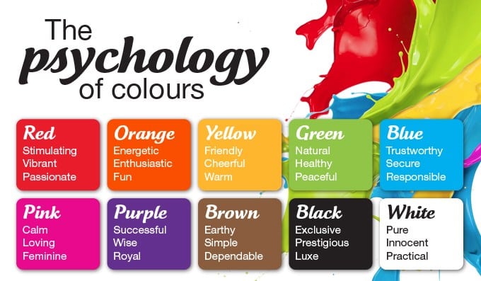
Don’t worry, neutral doesn’t mean boring. And keep in mind that color affects mood in different ways.

That being said, take a look at these great exterior paint color trends and pick one that works for you.

  1. White on White

From the popular farmhouse trend to a Mediterranean beach house, white is on point. And don’t be fooled, there’s more than one white. Painting your house white is tricky because there are so many whites from which to choose.

There are cool whites with blue or grey undertones. There are also warm whites with a hint of brown or cream. Some whites with brown undertones look the tiniest bit pink.

A white house sporting white trim offers a clean look that’s gorgeous. if you’re looking for something more striking, use white with a bold dark color for the trim.

If you opt for white, use one with a low light reflective value (LRV) for your home’s exterior. It won’t reflect the surrounding colors of the landscape or your neighbors’ homes.
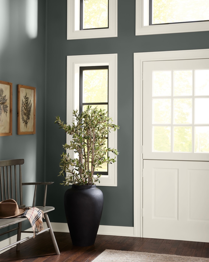
  1. Dark and Dramatic

Looking for something a little more dramatic for your home’s exterior? Almost no matter the type of home, it’ll look great with a bold dark color. Whether your house is mid-century modern, contemporary, or craftsman, a dark color looks great.

Colors gaining in popularity are dark greens, dark blues, and charcoals. Pair these dark colors with white trim.

Stormy Gray has a blue undertone for a unique and dramatic look. Looking for a beach or coastal feel? Try Stormy Gray. Pair it with white trim details.
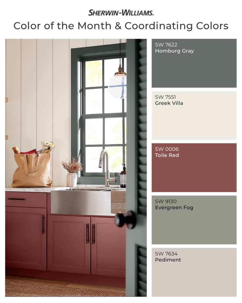
  1. The Famous Greige

Greige is taking over and for good reason. Greige is the marriage of gray and beige. Homeowners and buyers love greige. Beige infuses warm undertones while gray offers soft neutral tones.

The two colors together make greige. And it’s the perfect color for exterior as well as interior paint jobs.

  1. Safe Taupe

Taupe is a good exterior color for playing it safe if you’re selling soon. Tony Taupe from Sherwin-Williams (SW 7038) is a great neutral exterior color. It’s also one of the most popular, and it’s coming up big in 2019.

  1. A Classic – Desert Beige

This strong neutral tone pairs well with bold contrasting trim colors. The trim is a visual outline for your home’s exterior. This classic beige isn’t boring and pairs well with white gutters, corner strips, and soffits.

  1. Got the Blues?

Do you love blue? You’re not alone!

Many homeowners and buyers opt for blue. Deep bold blues make for great accent colors. Or do the entire exterior in a bold blue hue. If you choose a dark or bright blue, pair it with cool light trim colors.

Be bold with Peacock Blue and you’ll stand out from your neighbors!

Blue is another color that gives a coastal feel like Cape Cod in the summer. Try any sea-blue watery hue for a charming exterior. Ready to set your home apart? Try Sherwin-Williams Color of the Year: Oceanside.

  1. Almost Blue

You’re not ready for blue, but you want a nautical feel? Try a deep blue-gray exterior. You’ll get the nautical, coastal vibe without committing to full blue.

Pair with white trim for a neutral look. Not sure what white to look for? Your painting contractor can help. Speaking of contractors, make sure you hire a good one!
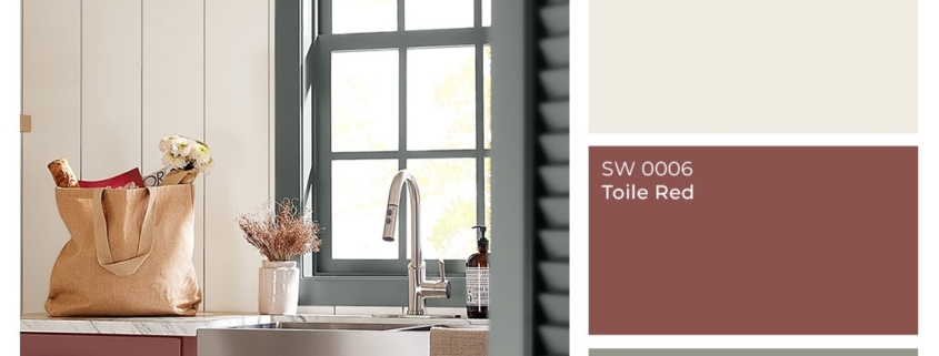
  1. Unexpected Red

As 2019 comes into full bloom, there are also some unexpected color trends. Here’s a trend you may not be sold on when it comes time to sell, but if you’re looking for something different, try a smoky red exterior.

A bright and cheerful lighthouse red is a traditional color, but it’s also fresh. It’s the perfect pairing for bright white trim. Paint the garage doors and soffits white as well.

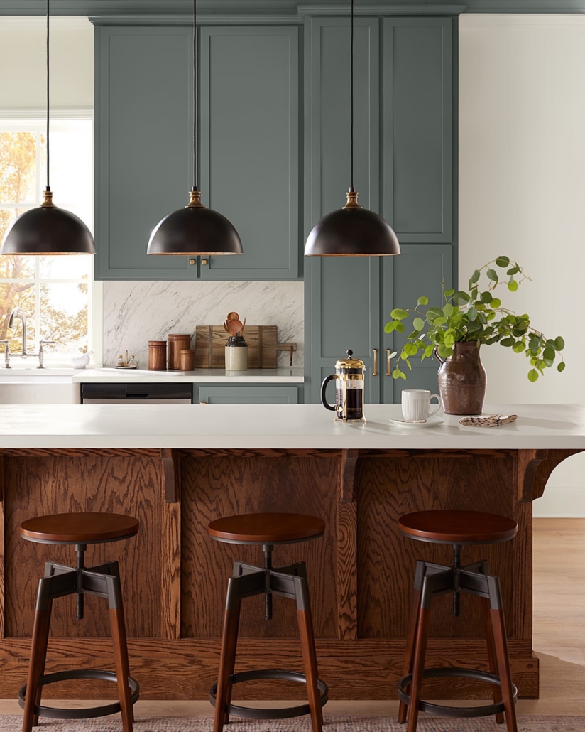
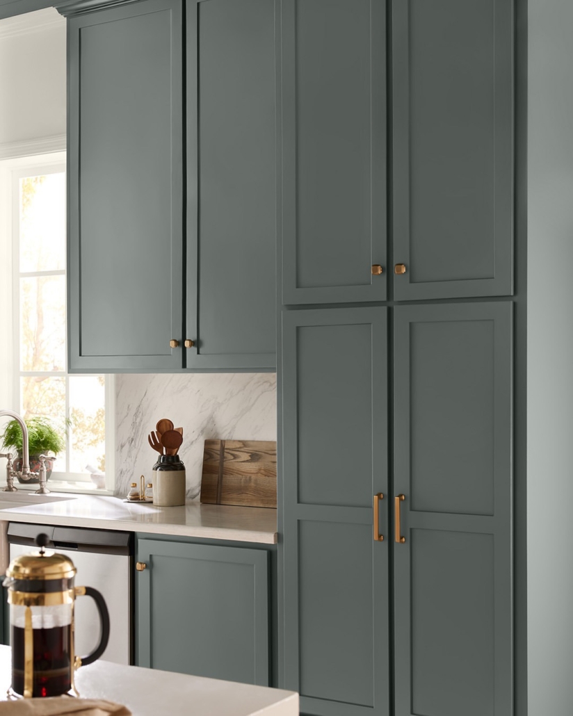
  1. Nature-Inspired Exterior Colors

No doubt 2019 decor takes lots of its inspiration from nature. If you’re looking for a retreat-like space, consider a moss green like Spanish Moss from Valspar. This woodsy green has brownish tones reminiscent of tree bark.

Looking for a more neutral green? Try Benjamin Moore’s Cypress Green. It’s a gray-green amalgamation that’s neutral without being boring. Try it with black or dark-gray shutters and trim.
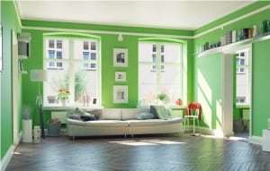
  1. Pale Yellow

Yellow is making a comeback. This cheerful hue says “happy!” But beware of going too bright. A nice toned-down pale shade is your best bet if you’re selling anytime soon.

Yellow looks great on a traditional craftsman or old Victorian. Pair it with a white porch and trim. Add gray details for a sophisticated look.

Exterior Paint Colors for 2019

There are so many great exterior paint colors for 2019. There’s something for everyone’s taste. If you’re painting your home with no plans for selling, go for whatever trend suits you best.

If you’re painting with selling in mind, stick to one of the more neutral trends. Neutral may seem boring, but it’s tried and true when it comes to selling your home.

Whether you’re going for a coastal blue or a lighthouse red, a fresh coat of exterior paint makes your home look great.

Are you ready for a new coat of exterior paint? Call us. We’re here to help!

We all have our favorite colours, but have you ever noticed how certain colours make you feel a certain way? That’s the premise of color psychology – the idea that colours evoke emotional, mental and even behavioral responses, and, therefore, can impact our mood.

Cool vs. Warm Colours

On a simple color wheel, you will find six basic colours – red, orange, yellow, green, blue and violet. When you divide the wheel in half, you divide it into cool and warm colours.

Warm colours include:

  • Red
  • Orange
  • Yellow

Cool colours include:

  • Green
  • Blue
  • Violet

Warm colours have an association with sunlight and heat. Therefore, they create a warm, lively, energetic and inviting space. On the other hand, cool colours remind us of nature, water and sky. Therefore, they bring out a calming, relaxing and peaceful feel.

To use the psychology of colours in making your painting choice:

  1. Determine the primary function of the room.

What will the room be used for? What activities will take place in that room? Who will be using the room and how do you want them to feel?

  1. Pair colours that convey a mood that matches that function.

In this way, you can guide people into thinking, feeling and behaving in a way that matches the intended purpose of the room.

Now that you understand how color psychology is used to make paint color choices, let’s look at the psychological effects of eight colours and what rooms they work best in.

Warm Colours

Red

Red is the most intense color, bursting with energy. Studies have found that it can increase adrenaline, raise blood pressure and speed up your heart & breathing rate. It’s a great choice if you want to stir up excitement and lively conversation in a particular room. It is also chosen for dining rooms because it can increase metabolism and, therefore, appetite.

Red works best in:

  • Dining rooms
  • Living rooms
  • Other rooms where people gather

Yellow

Yellow is associated with the sunshine, therefore, it stimulates warmth and happiness – when done right. Soft yellows work best to convey a cheery, uplifting and fun tone. However, bright yellows or an overwhelming amount of yellow in a room can cause frustration and anger. For example, studies found that babies cry more and people are more likely to lose their temper in yellow rooms. The solution – pay attention to the shade you use, the amount you use, and consider it in combination with other colours rather than dominating the color scheme.

Yellow works best in:

Orange

Orange combines some of the traits of red and yellow. Like red, orange is an energetic, enthusiastic and exciting color. Like yellow, orange is a warm, friendly and welcoming color. This makes it a good choice for some of the same rooms listed above, and some people also like it as an exercise room color because of its ability to help you get moving.

Orange works best in:

  • Kitchens
  • Dining rooms
  • Exercise/workout rooms

Cool Colours

Blue

Blue reminds us of natural elements – the calming light blue sky and the tranquil blue waters of lakes and streams. Its calming effects are said to slow down respiration and heart rate as well as lower blood pressure. The relaxing effects of blue are particularly felt with lighter shades; darker shades of blue can trigger feelings of sadness.

Blue works best in:

  • Bedrooms
  • Bathrooms
  • Offices

Green

The abundance of green found in nature makes this color evoke feelings of growth, renewal and rebirth. Green is a mix of blue and yellow – so it combines the cheerfulness of yellow with the calming effects of blue. It creates a mood of relaxation and tranquility and is believed to

help relieve stress.

Green works best in:

  • Bedrooms
  • Bathrooms
  • Living or family rooms
  • Any room where you want to promote comfort and calming

Violet (Purple)

A combination of red and blue, purple can take on different forms depending on the shade that you use. In lighter shades, it works similarly to blue – evoking feelings of relaxation and rest. In darker shades, it takes on some of red’s energetic notes, creating a dramatic and sophisticated feel that is associated with luxury and royalty.

Purple works best in:

  • Bedrooms (lavender)
  • Dining rooms (darker shades)
  • Any room you want to stimulate creativity
  • Any room you want to make appear more luxurious

Neutrals

So far we have discussed the main cool and warm colours on the color wheel, but neutral colours can also impact mood and emotion. Here’s a look at the two main neutrals – black and white.

Black

Black absorbs all light, so it represents the absence of color. This gives it a feeling of mystery and secrecy. You can use it in your paint colours to create a dramatic look or to add elegance. It is best used in small doses, though, because too much can convey a dark and melancholy mood.

Black is best used for:

  • Accents, not the main color
  • Highlighting other colours and bringing them to life (as in the above picture)
  • Giving depth to a room

White

In contrast to black, white reflects light and is therefore the presence of all colours. It represents purity, innocence, and wholeness. White can give your space an open and airy feel, even giving the illusion that there is more space in a room than is actually there.

White is best used for:

  • Creating a modern or contemporary feel (especially the kitchen)
  • Creating the appearance of more space
  • Accenting other color choices

Color psychology gives us insight into how certain colours impact mental, emotional and behavioural responses. It can, therefore, be used to guide paint color choices so the colours you use in a particular room help it achieve a particular mood, goal or function.

Use the guide below to help choose paint colours for your next interior painting project and you’ll find that your choices have a direct impact on how people feel and experience your home.