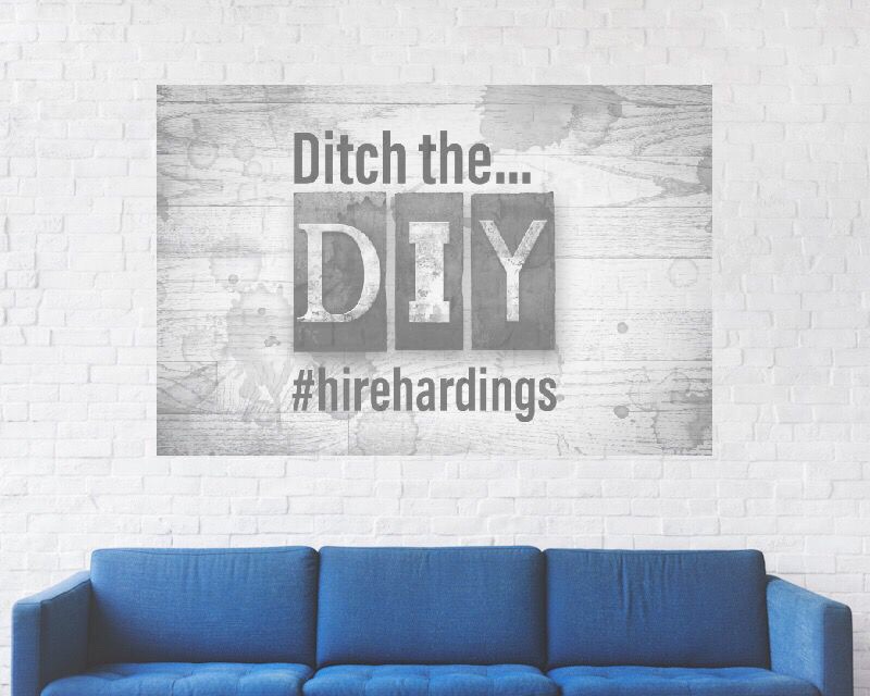
Shine some light on a Blue Monday and ditch the DiY. Hire Harding’s instead. We’re changing Blue Monday to February 11th, 2019 to be the most depressing day of the year in Calgary, Ab. After a week of the deep freeze with at another week to go, we think you’ll agree. (403)254-4726. Get A Quote #bluemonday #ditchthediy #yycrenovations #depression #cabinfever #enough #ineedsun #snowdays #freezing #freezingcold #yyc #yycliving #painting #cleaning #windowcleaning #nottoday #texturing #wegotthis #handyman #renovations #furnace #fireplace #decor #design #decorating #cuddletime #staywarm

From a new kitchen island to full basement developments, Harding’s Renovations team has your back. With over 40 years of experience in Calgary renovating and building homes. They specialize in basements but their abilities are endless. Start dreaming, ditch the DiY and get our Reno team in your home for a free estimate today! (403)254-4726 Get your free renovation estimate here! #startdreaming #ditchthediy #wegotthis #yycrenovations #renovations #redecorate #basement #remodel #development #yyc #yycnow #renovator #contractor #generalcontractor #designer #decorator #okotoks #airdrie #painting #buildit #builditandtheywillcome #partnership #cochrane #chestermere #dewinton #kitchen #bathroom #estimates

Setting up some cool shots with @CalgaryHonda, thanks for the great service! #happywithourhonda @hondacanada Harding’s – Your Improvement Company, Calgary, Ab (403)254-4726 Hardings’s Painting #painting #cleaning #texturing #windowcleaning #handyman #renovations #calgary #yyc #yycbuzz #yyclife

Dreaming of spring during this polar vortex? #paintit green so it’s spring all the time! #vortex #polarvortex #sherwinwilliams #dulux #addsomecolor #livingroomdecor #livingroom #kitchendesign #kitchen #bedroomdecor #bedroom #wegotthis #basement #decor #decorate #ditchthediy @ditchthediy #interiorpainting #residentialpainting #commercialpainting #condominium #interiordesign #interiordecorating #designideas #yyclife #yycbuzz #foothiils #rockyviewcounty #mountainview #green Free Painting Estimate

Awesome video review and testimonial from Pete the Plumber Calgary. Pete is a great guy that we’ve had many opportunities to work with both on commercial and residential projects. Thanks for the shout out Pete! Catch Pete Sunday mornings on CTV at 10am, where Pete and his friends show you ‘how to’ tackle all your plumbing problems. Harding’s Painting. (403)254-4726

        Pete The Plumber Testimonial

#calgary #plumbing #hearing #hvac #showroom #painting #commercial #residential #review #testimonial #petetheplumber #hirehardings #ditchthediy www.hardingsservices.com #yycpainting #yycplumbing #yeg #edmonton #superhero #plumbingandheating #partners #partnership #thanks

Proudly serving Calgary and Southern Alberta since 1996. We spread the paint, you spread the word! #proud #calgary #yyc #southernalberta #foothills #mountainview #rockyview #yycnow #whatdrivesyou #wegotthis #braggcreek @priddis #okotoks #turnervalley #blackdiamond #highriver #airdrie #okotoks #chestermere #cochrane #painting #cleaning #popcornceilingremoval #texturing #handyman #renovations #windowcleaning www.hardingsservices.com

I just watched a video this morning with @grantcardone and it reminded me of everything that’s wrong with this world. At Harding’s we respect family because we are one. All of our contractors and our Licensees, we’re a family. ________Remember to take time out for your family. Family is why we do what we do @hardingsservices. By doing the hard work and trying our best to meet our clients needs, it provides for my family and many others in our organization. It provides a service(s) to our clients making it easier for them to ditch the DiY and free up time for their families, it improves their homes and lives to help add to the quality of their lives with their families. The saying goes work hard and play harder. We agree, just make sure you take the time to play with your family too! Time is one thing you never get back. @deanbrody #favsongtime

#ditchthediy—————-• If you want the #pursuitofhapiness then do things that bring you #joy_________________(403)254-4726 www.hardingsservices.com #family #hardingsservices #calgary #yyc #yyclife #familytime #takethetime #worklife #worklifebalance #respect #thanks #lovemyfamily #balance #sorryfortherant #homeimprovement

Ditch the DiY and get one of these estimating vehicles in front of your house today! Super stoked to see these on the roads. What do you guys think of our new design, courtesy of @ignitionwraps in Calgary. They do great work. (403)254-4726 www.hardingsservices.com #painting #paintit #decorate #interior #exterior #residential #commercial #sherwinwilliams #dulux #generalpaint #benjaminmoore #addsomecolor #livingroomdecor #kitchendecor #bedroomdecor #decor #wegotthis #ditchthediy #hirehardings #yyc #yyclife #yycbuzz #calgary #calgarylife #rockymountains #foothills #rockyviewcounty 

I had been a believer in post secondary education. Get the degree, get the degree! My father instilled to my brothers and I that we were not to work in the trades. He’d say go to school, stay away from working in restaurants (even though we ere involved in ownership of 2) and that White Collar work was commendable. He was not wrong but he was not right either.

I am a people person, so I found myself drawn to restaurants. Hanging out there, working there and finally making a career in them. As life happened and I transitioned into building restaurants my passion for building brought me closer to the typical trades of carpentry, electrics, plumbing, painting etc..  I built a lot of great relationships with these trades people. Relationships that have stood the test of time. Reliable, trustworthy and down to earth people who I now call friends.

I started to notice a decline in restaurant franchising because of the costs associated with it. I quickly realized that trades was a great route for franchising. That lead me to Harding’s, an opportunity to work daily with these people I admired so much and help take their small businesses to the next level. There has been a decline in ‘work’ effort in recent years and yet the trades continues to get hard working men and women busting their butts to put food on the table. And they do, very well I might add. Margins that some trades are seeing are far better than typical businesses. Your overhead is lower, your labour is already skilled and product cost is very reasonable with great markup potential. In short, franchising in trades is where its at.

I recently watched this TedX Talk with Mike Rowe, from Discovery Channel’s – Dirty Jobs. I was so wrong about him. I assumed he was a Blue Collar grunt chosen from his trade background. I was pleasantly surprised to find him eloquent, very well educated and inspiring. His belief in trades and his experience gained from working along side of so many hard working trades people is spot on.

A career in the trades is commendable, there is no shame in it and a lot of money to be made in it. Don’t sell yourself short and play yourself long on higher education and the massive debt that can go with it. Take a look at the trades!

We all have our favorite colours, but have you ever noticed how certain colours make you feel a certain way? That’s the premise of color psychology – the idea that colours evoke emotional, mental and even behavioral responses, and, therefore, can impact our mood.

Cool vs. Warm Colours

On a simple color wheel, you will find six basic colours – red, orange, yellow, green, blue and violet. When you divide the wheel in half, you divide it into cool and warm colours.

Warm colours include:

  • Red
  • Orange
  • Yellow

Cool colours include:

  • Green
  • Blue
  • Violet

Warm colours have an association with sunlight and heat. Therefore, they create a warm, lively, energetic and inviting space. On the other hand, cool colours remind us of nature, water and sky. Therefore, they bring out a calming, relaxing and peaceful feel.

To use the psychology of colours in making your painting choice:

  1. Determine the primary function of the room.

What will the room be used for? What activities will take place in that room? Who will be using the room and how do you want them to feel?

  1. Pair colours that convey a mood that matches that function.

In this way, you can guide people into thinking, feeling and behaving in a way that matches the intended purpose of the room.

Now that you understand how color psychology is used to make paint color choices, let’s look at the psychological effects of eight colours and what rooms they work best in.

Warm Colours

Red

Red is the most intense color, bursting with energy. Studies have found that it can increase adrenaline, raise blood pressure and speed up your heart & breathing rate. It’s a great choice if you want to stir up excitement and lively conversation in a particular room. It is also chosen for dining rooms because it can increase metabolism and, therefore, appetite.

Red works best in:

  • Dining rooms
  • Living rooms
  • Other rooms where people gather

Yellow

Yellow is associated with the sunshine, therefore, it stimulates warmth and happiness – when done right. Soft yellows work best to convey a cheery, uplifting and fun tone. However, bright yellows or an overwhelming amount of yellow in a room can cause frustration and anger. For example, studies found that babies cry more and people are more likely to lose their temper in yellow rooms. The solution – pay attention to the shade you use, the amount you use, and consider it in combination with other colours rather than dominating the color scheme.

Yellow works best in:

Orange

Orange combines some of the traits of red and yellow. Like red, orange is an energetic, enthusiastic and exciting color. Like yellow, orange is a warm, friendly and welcoming color. This makes it a good choice for some of the same rooms listed above, and some people also like it as an exercise room color because of its ability to help you get moving.

Orange works best in:

  • Kitchens
  • Dining rooms
  • Exercise/workout rooms

Cool Colours

Blue

Blue reminds us of natural elements – the calming light blue sky and the tranquil blue waters of lakes and streams. Its calming effects are said to slow down respiration and heart rate as well as lower blood pressure. The relaxing effects of blue are particularly felt with lighter shades; darker shades of blue can trigger feelings of sadness.

Blue works best in:

  • Bedrooms
  • Bathrooms
  • Offices

Green

The abundance of green found in nature makes this color evoke feelings of growth, renewal and rebirth. Green is a mix of blue and yellow – so it combines the cheerfulness of yellow with the calming effects of blue. It creates a mood of relaxation and tranquility and is believed to

help relieve stress.

Green works best in:

  • Bedrooms
  • Bathrooms
  • Living or family rooms
  • Any room where you want to promote comfort and calming

Violet (Purple)

A combination of red and blue, purple can take on different forms depending on the shade that you use. In lighter shades, it works similarly to blue – evoking feelings of relaxation and rest. In darker shades, it takes on some of red’s energetic notes, creating a dramatic and sophisticated feel that is associated with luxury and royalty.

Purple works best in:

  • Bedrooms (lavender)
  • Dining rooms (darker shades)
  • Any room you want to stimulate creativity
  • Any room you want to make appear more luxurious

Neutrals

So far we have discussed the main cool and warm colours on the color wheel, but neutral colours can also impact mood and emotion. Here’s a look at the two main neutrals – black and white.

Black

Black absorbs all light, so it represents the absence of color. This gives it a feeling of mystery and secrecy. You can use it in your paint colours to create a dramatic look or to add elegance. It is best used in small doses, though, because too much can convey a dark and melancholy mood.

Black is best used for:

  • Accents, not the main color
  • Highlighting other colours and bringing them to life (as in the above picture)
  • Giving depth to a room

White

In contrast to black, white reflects light and is therefore the presence of all colours. It represents purity, innocence, and wholeness. White can give your space an open and airy feel, even giving the illusion that there is more space in a room than is actually there.

White is best used for:

  • Creating a modern or contemporary feel (especially the kitchen)
  • Creating the appearance of more space
  • Accenting other color choices

Color psychology gives us insight into how certain colours impact mental, emotional and behavioural responses. It can, therefore, be used to guide paint color choices so the colours you use in a particular room help it achieve a particular mood, goal or function.

Use the guide below to help choose paint colours for your next interior painting project and you’ll find that your choices have a direct impact on how people feel and experience your home.