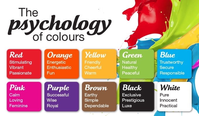
We all have our favorite colours, but have you ever noticed how certain colours make you feel a certain way? That’s the premise of color psychology – the idea that colours evoke emotional, mental and even behavioral responses, and, therefore, can impact our mood.
Cool vs. Warm Colours
On a simple color wheel, you will find six basic colours – red, orange, yellow, green, blue and violet. When you divide the wheel in half, you divide it into cool and warm colours.
Warm colours include:
- Red
- Orange
- Yellow
Cool colours include:
- Green
- Blue
- Violet
Warm colours have an association with sunlight and heat. Therefore, they create a warm, lively, energetic and inviting space. On the other hand, cool colours remind us of nature, water and sky. Therefore, they bring out a calming, relaxing and peaceful feel.
To use the psychology of colours in making your painting choice:
- Determine the primary function of the room.
What will the room be used for? What activities will take place in that room? Who will be using the room and how do you want them to feel?
- Pair colours that convey a mood that matches that function.
In this way, you can guide people into thinking, feeling and behaving in a way that matches the intended purpose of the room.
Now that you understand how color psychology is used to make paint color choices, let’s look at the psychological effects of eight colours and what rooms they work best in.
Warm Colours
Red

Red is the most intense color, bursting with energy. Studies have found that it can increase adrenaline, raise blood pressure and speed up your heart & breathing rate. It’s a great choice if you want to stir up excitement and lively conversation in a particular room. It is also chosen for dining rooms because it can increase metabolism and, therefore, appetite.
Red works best in:
- Dining rooms
- Living rooms
- Other rooms where people gather
Yellow
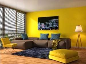
Yellow is associated with the sunshine, therefore, it stimulates warmth and happiness – when done right. Soft yellows work best to convey a cheery, uplifting and fun tone. However, bright yellows or an overwhelming amount of yellow in a room can cause frustration and anger. For example, studies found that babies cry more and people are more likely to lose their temper in yellow rooms. The solution – pay attention to the shade you use, the amount you use, and consider it in combination with other colours rather than dominating the color scheme.
Yellow works best in:
- Kitchens
- Dining rooms
- Bathrooms
Orange
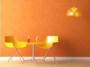
Orange combines some of the traits of red and yellow. Like red, orange is an energetic, enthusiastic and exciting color. Like yellow, orange is a warm, friendly and welcoming color. This makes it a good choice for some of the same rooms listed above, and some people also like it as an exercise room color because of its ability to help you get moving.
Orange works best in:
- Kitchens
- Dining rooms
- Exercise/workout rooms
Cool Colours
Blue
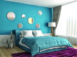
Blue reminds us of natural elements – the calming light blue sky and the tranquil blue waters of lakes and streams. Its calming effects are said to slow down respiration and heart rate as well as lower blood pressure. The relaxing effects of blue are particularly felt with lighter shades; darker shades of blue can trigger feelings of sadness.
Blue works best in:
- Bedrooms
- Bathrooms
- Offices
Green
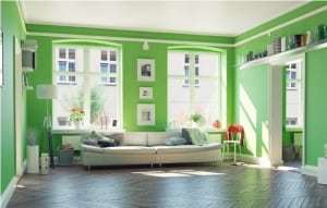
The abundance of green found in nature makes this color evoke feelings of growth, renewal and rebirth. Green is a mix of blue and yellow – so it combines the cheerfulness of yellow with the calming effects of blue. It creates a mood of relaxation and tranquility and is believed to
help relieve stress.
Green works best in:
- Bedrooms
- Bathrooms
- Living or family rooms
- Any room where you want to promote comfort and calming
Violet (Purple)
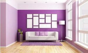
A combination of red and blue, purple can take on different forms depending on the shade that you use. In lighter shades, it works similarly to blue – evoking feelings of relaxation and rest. In darker shades, it takes on some of red’s energetic notes, creating a dramatic and sophisticated feel that is associated with luxury and royalty.
Purple works best in:
- Bedrooms (lavender)
- Dining rooms (darker shades)
- Any room you want to stimulate creativity
- Any room you want to make appear more luxurious
Neutrals
So far we have discussed the main cool and warm colours on the color wheel, but neutral colours can also impact mood and emotion. Here’s a look at the two main neutrals – black and white.
Black
Black absorbs all light, so it represents the absence of color. This gives it a feeling of mystery and secrecy. You can use it in your paint colours to create a dramatic look or to add elegance. It is best used in small doses, though, because too much can convey a dark and melancholy mood.
Black is best used for:

- Accents, not the main color
- Highlighting other colours and bringing them to life (as in the above picture)
- Giving depth to a room
White
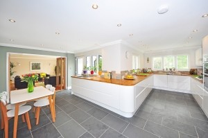
In contrast to black, white reflects light and is therefore the presence of all colours. It represents purity, innocence, and wholeness. White can give your space an open and airy feel, even giving the illusion that there is more space in a room than is actually there.
White is best used for:
- Creating a modern or contemporary feel (especially the kitchen)
- Creating the appearance of more space
- Accenting other color choices
Color psychology gives us insight into how certain colours impact mental, emotional and behavioural responses. It can, therefore, be used to guide paint color choices so the colours you use in a particular room help it achieve a particular mood, goal or function.
Use the guide below to help choose paint colours for your next interior painting project and you’ll find that your choices have a direct impact on how people feel and experience your home.